Containers direct, based in Garston, Liverpool, supply a wide range of new and second-hand shipping containers, site cabins and site offices across the UK. They came to us recently for assistance with their mascot design as well as a logo and website redesign.
As this was a rebranding project, the client was open to suggestions. This included a change of colour theme, illustrations, icons, fonts, etc, In fact, a whole new identity – naturally, we saw this as a brilliant design opportunity!
We are huge fans of using characters in web design; they can work really well if utilised in the correct way; not only do they work for visual impact, they can also steer an audience in the right direction and provide a deeper connection.
Mascot design and illustration are not just limited to the gaming community. Businesses of all types are reaching out to illustrators to provide them with their own mascot – making them stand out from the crowd. A good mascot design icon can help make your business friendly and approachable, and like our little chap with wide eyes and a cheeky smile, this can appeal to a lot of people.
However, some companies get the use of mascot design in their projects all wrong. Some end up taking the easy option of going down the stock image route. The end result is a mascot which is rarely a hit – it’s impossible to create a memorable and recognisable brand if the images are not unique to the company.
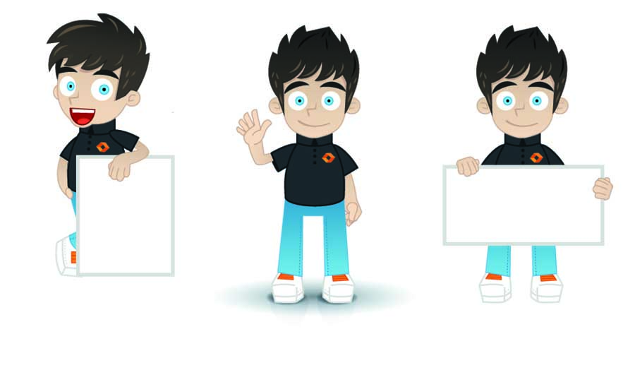
Containers Direct did originally have a mascot on their webpage. It was our remit to redesign him and give him a makeover. The plan was to have the mascot to appear in each of the 8 homepage slideshow banners of the new website.
On projects like these, the majority of work goes into planning and sketching out ideas. This helps to create the simple shapes. We then build the form and composition to get the feel for the character.
Once we’re happy with the final sketch, it’s then over to Adobe Illustrator where we begin building up the layers using vector shapes. To finish off, we add smaller detailed assets and gradients to create depth and make the mascot come to life.
The aim of this mascot was to not detract too much from the main brand identity. We had to compliment the design and allow the mascot to be worked into on-going promotions and information boards. To achieve this, we gave him a smart uniformed look, dressing him in a black t-shirt with the rebranded logo on his chest.
Studiowide provided all graphic design services on this project, including mascot design, logo and website design. On this occasion, we worked with our client’s web host package provider, who then placed our design into the current website template.
Overall, the customer was extremely happy with this rebranding project, especially the mascot design!