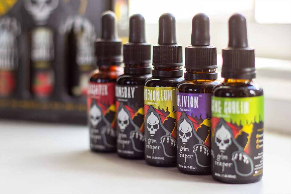
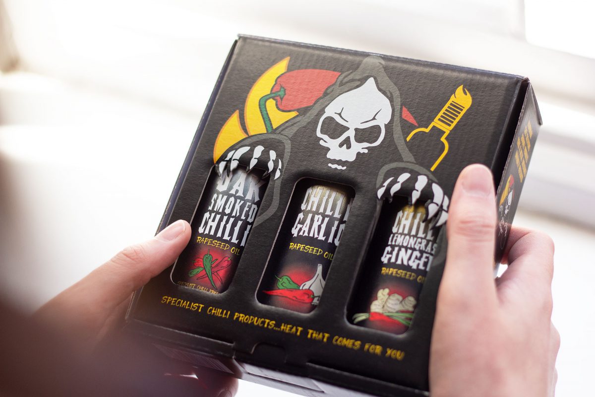
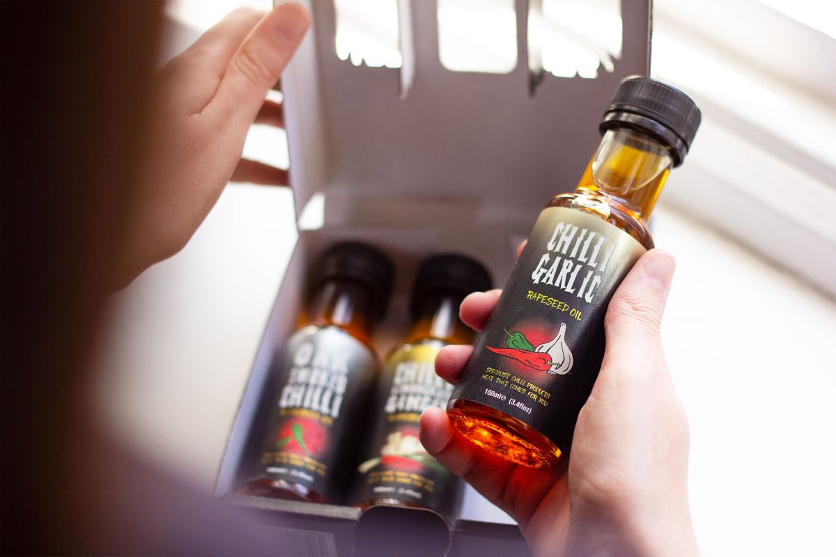
Grim Reaper Foods are chilli specialists who manufacture multi-award winning products. The company produces a wide range of high quality, mouth-watering, handmade chilli products, including hot sauces, BBQ rubs, chilli extracts, infused rapeseed oils and chilli chocolates.

We have worked for a number of food manufacturers over the years, building up a reputation for producing bespoke, eye-catching branding and food packaging design in this sector.  Grim Reaper Foods got in touch as they wanted to refresh their packaging design and create a more consistent style across their complete range of products.

One of the challenges for us with this project was creating packaging designs that would stand out in the highly competitive and creative market of chilli and chocolate products. The designs needed to be eye-catching whilst also demonstrate an element of ‘fear’; reflecting the Scoville scale of chilli hotness.

Another challenge for us to overcome was the size of the oil extract bottles, they presented a problem with the legibility of the text and a loss in illustrative detail.

The client also wanted a gift box designing, that would contain three hot sauces. We needed to ensure the box complemented and didn’t compete with the bottle designs, as the bottles would be visible through the cut out windows.

The creation of the label designs evolved around the Grim Reaper Foods logo itself, as we thought it was illustrative enough as a standalone image to convey the extreme heat levels of their products. We also decided to give each product in the chilli extract range a specific colour scheme, so they were easily identifiable and looked different but consistent as a set.

To combat the legibility issue with the chilli extract bottles, we went through a process of trial printing the labels to ensure we balanced the font sizes correctly. We also increased the size of the logo to make sure it would stand out on the shelf.

As for the gift box design, we created a custom cut template with an attention-grabbing design of the Grim Reaper appearing to reach out and hold the bottles contained within the box. This was eyecatching enough to draw attention to the packaging, but was subtle enough not to distract from the bottle designs.

The client was thrilled with the final designs. The product range looked professional, made great use of their logo, and created consistency across the brand. Check out the finished products below.

Illustration

Packaging Design

Brand Identity